Stock tables and charts are key tools investors use to analyze and track stock performance. They visually show a stock’s price changes, trading volume and other important metrics over time. It is essential to know how to read stock tables and charts if you want to invest in the stock market.
Charting stocks has a long history, dating back to 18th century in Japan. The idea became popular in the West in the late 1800s with the start of technical analysis. Today all types of investors, from individuals to big institutions, use stock charts to make smart investment decisions.
Learning about how to read and explain stock tables and charts can help investors spot trends, find potential buy or sell chances, and manage portfolio risk.
Anatomy of a Stock Quote
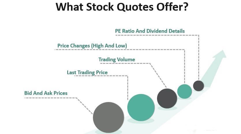
A stock quote gives investors essential details to evaluate a stock’s performance and make smart trades. Knowing the main components of a stock quote is very important for anyone who is looking to invest in the stock market.
Overview of what a stock quote is and its importance
A stock quote shows current trading price and other useful data about a stock in real-time. It gives investors up-to-date information about company stocks, allowing them to assess its value and growth potential. Stock quotes are necessary for investors as they provide market sentiment insights to shape investment strategies.
Key components of a Stock Quote
To make smart stock market decisions, you need to know how to read stock tables and charts. Here are the main components of a stock quote:
52-Week High and Low
The 52-week high/low shows the highest and lowest price of the stock traded over the past year. This information reveals stock’s volatility and helps investors gauge its performance versus the stock’s price history. Comparing a stock’s current price to its 52-week high/low can show if a stock is undervalued or overvalued right now.
Company Name & Stock Type
The stock quote shows the company name and traded stock whether it’s common stock, preferred shares, etc. This information helps investors identify the specific security in which they are interested and know the rights and privileges related to that stock type.
Ticker Symbol
A ticker symbol is a unique combination of letters assigned to each security traded on an exchange. Tickers let investors quickly identify and track specific stocks. It is important for placing trade orders and monitoring stock performance.
Dividend Per Share
The dividend per share is the cash amount a company pays out to its shareholders for each share they own. This information is important for investors who prioritize regular dividend payments.
Dividend Yield
The dividend yield expresses the annual dividend payment as a percentage of the current stock price. This metric helps investors compare various dividend-paying stocks and estimate potential income from their investments.
Price/Earnings Ratio
The price-to-earnings (P/E) ratio compares the current stock price of a company to its earnings per share. A high P/E ratio suggests that a stock is overvalued, while a low P/E ratio means the stock is undervalued. It helps investors assess the relative value of stocks as compared to their peers and the overall market.
Trading Volume
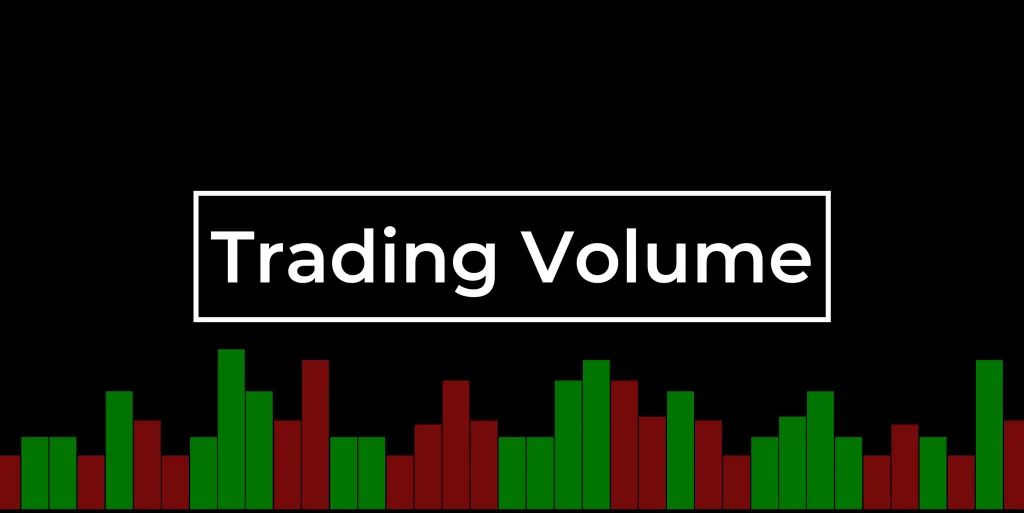
Trading volume is the total number of shares traded in a certain period. High volume signals strong market interest and liquidity, while low volume could mean limited interest or difficulty buying or selling shares.
Day High and Low
The day high and low are the highest and lowest prices the stock has traded so far today. These values help investors understand stock’s intraday volatility and spot potential entry or exit points.
Close
The closing price is the final price at the end of the trading session. The closing price serves as a benchmark for evaluating a stock’s performance over time and calculating indicators and market indices.
Net Change
Net change is the difference between today’s price and yesterday’s closing price. A positive net change means the price has increased, while a negative change shows a decrease in price.
Recognizing Stock Quote Data
Stock quotes provide valuable information to make smart investing decisions. Here are some main points while analyzing stock quote data:
- Bid/ask prices: These represent the highest price buyers are willing to pay (bid), and lowest price a seller is ready to accept (ask) for a stock. The difference is called bid-ask spread, which indicates stock’s liquidity.
- Last trade price: last trade price is the most recent price the stock is traded at. It provides a snapshot of current market value of a stock.
- Opening price: opening price is the first recorded trade price in a day. Comparing it to previous day’s closing price helps to assess market sentiment.
- Shares short: shares short is the number of shares being short sold, where investors borrow and sell shares hoping to buy back later at lower price.
- Dividend: It is a portion of company earnings paid out to shareholder per share. Dividends indicate financial health of company and its ability to provide return value to shareholders.
- Earnings per share EPS: EPS is the sum of earnings paid per share over last 12 months. It is a key metric for assessing company’s profitability.
- Price-to-earnings ratio(P/E ratio): P/E ratio compares current share price to its earnings per share. It is used to assess how expensive a stock is in terms of its earnings and allow valuation comparisons across industry peers.
Understanding Stock Price Charts
Stock price charts are important for investors to analyze and interpret stock performance over time. These stock price charts visually represent price movement of a stock, help investors spot trends, patterns and potential trading opportunities.
These charts offer a comprehensive historical view of a stock’s performance and also play an important role in investment analysis. By studying stock price charts, investors gain valuable insights into market sentiment, volatility and potential future price movements.
Types of Stock Charts
There are three main types of stock charts investors use generally:
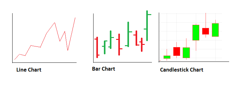
Line Charts
It is the simplest type of stock chart that shows closing price of a stock over a time period. Line charts give a simple view of a stock’s price movement and help spot overall trends.
Bar Charts
Bar charts show a comprehensive view of stock performance by representing opening, closing, high and low prices for each trading period. This extra data helps investors gauge stock’s volatility and trading range.
Candlestick Charts
Candlestick charts are like bar charts, but they offer a more visually appealing and comprehensive analysis of price action. Each candlestick chart shows price fluctuations over a given period. The body of chart shows the opening and closing prices, while the wicks show high and low prices. Candlestick patterns can be used to spot potential trend reversals and continuations.
Components of a Stock Chart
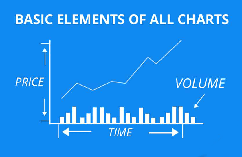
To read and interpret stock charts, it’s important to know these main components which are:
- Price Scale – price scale is a vertical scale on the right side of chart showing the price range of a stock.
- Time Scale – Horizontal scale at the bottom of the chart shows analyzed time periods
- Volume Bars – Bars symbolize the number of shares traded during each time period, often displayed below price chart.
- Moving Averages – Lines that smooth out price data by calculating the average price over given time periods and help identify trends
Reading Stock Charts
Reading charts means analyzing the data for each chart type. Investors should observe trends like higher highs and higher lows in uptrends or lower highs and lower lows in downtrends. Investors need to observe price patterns like head and shoulders or double tops/bottoms which indicate potential trend reversals.
It is important for investors to check out volume compared to price. Increasing volume confirms trend strength, while falling volume suggests weak conviction or a potential change in trends.
Key candlestick patterns
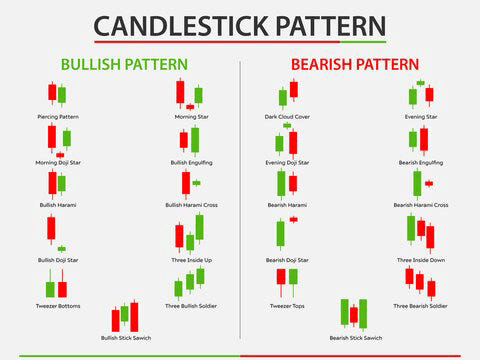
Traders analyze various candlestick patterns to learn about market sentiment and possible price movements:
- Bullish Patterns: Hammer, Inverted Hammer, Bullish Engulfing and Morning Star signal potential upward trends
- Bearish Patterns: Shooting Star, Hanging Man, Bearish Engulfing and Evening Star signal potential downward trends
Introduction to Technical Analysis
Technical analysis is a powerful tool investors and traders use to study markets and make informed investing choices. It means analyzing historical price and volume data to spot trends, patterns and trading opportunities.
Basics of Technical analysis
At its core, technical analysis means that market prices show all available data and that price movements are not random. It involves following identifiable trends and patterns to guess the future price fluctuation. By studying past price and volume data, analysts gain insights into market sentiment and find potential buys or sells opportunities.
Tool and Indicators used in technical analysis
Analysts use various tools and indicators to analyze market data. Some of the most used ones are:
Moving Averages
Moving averages smooth out price data by calculating average price over a given period. They assist in identifying trends and potential support or resistance levels.
MACD (Moving Average Convergence Divergence)
MACD is a momentum indicator showing relationship between two moving averages. It helps gauge trend strength and direction of a trend and can signal trend reversals.
RSI (Relative Strength Index)
The Relative Strength Index (RSI) measures how fast prices change. It spots overbought or oversold conditions and can show potential trend reversals.
Apply Technical Analysis to Stock Charts
To use technical analysis well, traders must know how to read the stock charts. This means spotting key chart patterns like:
- Trendlines – lines joining high and low price on a chart represent the trend direction.
- Support/resistance levels – the prices where previous buying/selling of interest occurred may act as hindrance to future price fluctuations.
- chart patterns Formations like head/shoulders or triangles in stock charts signal possible trend reversals or continuations.
Interpreting Volume and Market Depth
Volume and depth are essential stock trading concepts. Studying them provides insights into sentiment, liquidity and potential price moves.
Significance of Trading Volume
Trading volume is the total number of shares or contracts traded in a period. It’s an important indicator of market activity and helps traders spot trends and see how strong price movements are.
- High trading volume often signals strong interest in a stock, which can lead to big price swings. When a stock with high volume experiences increases in price, it suggests bullish sentiment is strong and trend will likely continue.
- On flip side, decrease in prices of stocks on heavy volume may show strong bearish sentiment and risk of further price drops ahead.
- Low volume could mean lack of interest or conviction among traders, making it harder to predict future price movements.
Understanding Market Depth
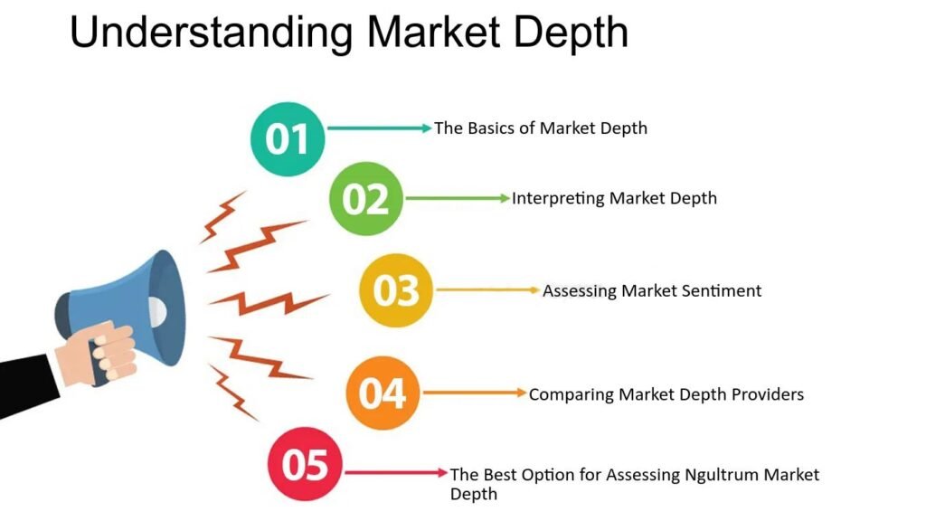
Market depth is also referred to as an order book, which shows pending buy and sell orders for a stock at different price levels. It gives a snapshot of supply and demand dynamics of market.
Definition and information it Provide
Order book data includes the following main characteristics, which are:
- Number of bids (buy orders) and asks (sell orders) at each price
- Total volume of shares or contracts available at each price
- Spread between highest bid and lowest ask prices
Analyzing this, traders can gauge buying/selling pressure, spot potential support/resistance levels, and see if market can absorb large orders without having a big impact on price.
Reading a Market Depth Chart
To interpret order book data, look at following main points:
- A lot of buy orders at a given price level may show strong support as there is reasonable demand for those stocks at that price level.
- Similarly, many sell orders around a specific price level may symbolize resistance level, as ample supply of shares is available at that price.
- The spread between highest bid and lowest ask price indicates information about the liquidity of stock. A narrow spread signals high liquidity, while wide spreads mean lower liquidity and potentially higher volatility.
Combining Volume with Market Depth Analysis
Together, volume and order book analysis give an overall view of market conditions. Traders can confirm between price action and volume and also gauge the strength of support and resistance levels based on the depth of order prices.
For example, if price breaks a resistance level on high volume and many buy orders above that price level, it may signal strong bullish sentiment and potential for prices to run higher.
Using Trendlines and Support/Resistance Levels
Trendlines and support/resistance levels help traders identify potential entries, exits and overall market sentiment. Combining these technical tools allows investors to make more effective strategies and smart choices.
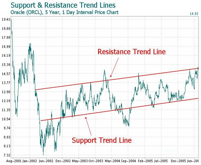
Drawing and Interpreting Trend Lines
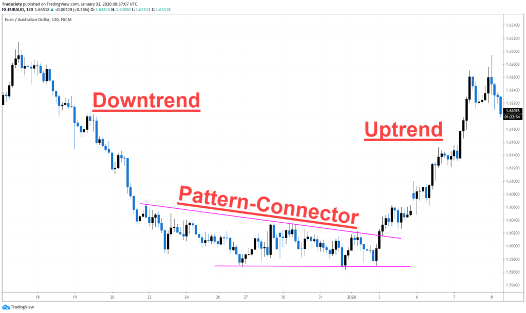
Trend lines connect a series of highs and lows, usually high in a downtrend and low in uptrend, it help investors spot the market’s direction and potential areas where prices might find support or resistance.
To draw a trend line:
- Identify if the overall trend is (uptrend or downtrend).
- Connect at least two significant highs (downtrend) or lows (uptrend).
- Extend the line to forecast where future prices may go.
The more times the price touches the trend line without breaking it, the more important the line becomes. A break in the trend line with an increase in price may signal that the potential trend might reverse.
Support and Resistance Levels
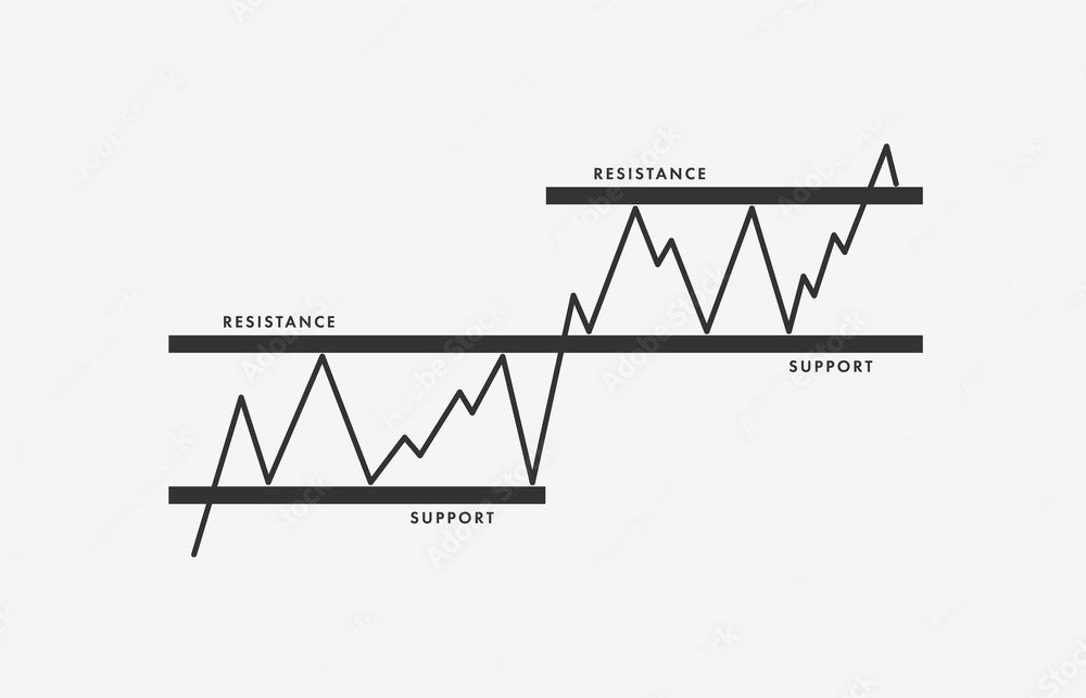
Support and resistance are price levels where buying (supports) or selling (resistance) interest has happened before. You can spot them by looking at past price action, especially at high low points.
- Support levels are where enough buyers are present to prevent prices falling further.
- Resistance levels are where enough sellers are available to prevent prices from rising further.
When prices approach support or resistance, traders watch for bounces or breakouts. A bounce means prices hit a level and reverse, while a breakout means prices push through the level, signalling shifting sentiment.
Combining Trend Lines with Support and Resistance
Traders can build better trading plans by putting trend lines together with support and resistance levels. Some examples are:
- Watch for long entries when prices bounce up from a rising trend line and a support level.
- Consider short entries when prices drop down from a falling trend line and a hit resistance level.
- Use trend line breaks along with support/resistance breakouts to confirm possible trend reversals.
When technical indicators line up, traders may feel more sure about their choices. It is important for investors to understand that no indicator or combination is perfect. Traders should always think about risk and market fundamentals when deciding trades.
Comparing Stock Charts

It is important to observe the performance of different stocks in investment analysis. Knowing how stocks in the same sector or industry perform relative to each other is crucial for investment analysis. It helps investors make smarter choices.
Stocks in the same sectors usually face similar market conditions, regulations and economic factors. Seeing how they perform provides useful information about companies that do better than their peers and which ones are lagging behind.
Overlay charts let investors plot multiple stocks on one chart to visually compare their price moves over time. Analyzing the relative performance of stocks highlights trends and helps investors make decisions about which companies are stronger or weaker in a sector.
Lots of chart platforms have built-in tools especially for stock comparison. These tools include creating overlay charts, calculating strength, and other comparative analysis to help investors do thorough research and make informed decisions.
Comparing Price Performance
Looking at stocks based on price performance is important to spot outperforming and underperforming stocks. Analyzing their relative strength and weakness helps investors make smarter calls on what to buy, hold or sell.
To spot top performers, look for stocks that consistently beat their peers and the broader market on returns. Underperformers will lag behind when the market rises or even lose value.
Compare a stock’s performance with its sector, industry or overall market. Stocks showing relative strength tend to beat the market when it’s trending up, while weak ones may underperform or drop more sharply in downturns.
Divergences happen when a stock’s price moves opposite to its relative strength, signaling a potential trend change ahead. Convergences occur when price and relative strength move together, confirming the existing trend.
Practical Tips for Using Stock Charts
When using stock charts, follow these best practices to analyze effectively and make smart decisions. Here are some following tips:
- Start simple with line or bar charts before moving on to complex candlesticks.
- First understand basic patterns like support/resistance levels, before exploring advanced indicators.
- Use multiple timeframes (daily, weekly, monthly) to spot short and long term trends.
- Combine technical and fundamental analysis for a more complete approach.
- Practice paper trade or use a demo account before risking real capital.
- Make a trading plan with entry/exit strategies, risk management, position sizing and stick to it.
- Keep educating yourself and stay updated on new market developments and techniques.
- Avoid overcomplicating charts with too many indicators – it can cause analysis paralysis.
- Be patient, disciplined and avoid emotional or impulsive trading decisions.
Recognizing Chart Patterns
Chart patterns are visual price movements that provide useful insights on market trends and trading opportunities. Some keypoints which are:
- Support and resistance levels show where the price has previously faced buying or selling pressures. These act as barriers for future price moves.
- Trendlines connect a series of highs or lows, revealing the direction of the prevailing trend.
- Reversal patterns like head and shoulders, double/triple, tops and bottoms and cup and handle formations signal potential trend reversals.
- Continuation patterns like flags, pennants and triangles (ascending, descending and symmertical) which suggest brief pauses before the trend potentially resumes.
- Bilateral patterns like rectangles and diamond information can indicate upcoming breakouts or breakdowns in either direction.
How Investors Use Stock Charts

Stock charts give investors versatile tools to improve their strategies. Here are some practical approaches to follow:
Practical applications of stock charts in investment strategies
Investors use charts to spot entry and exit points for trades based on patterns and indicators. Charts also help set stop-loss orders and take-profit targets to manage risk and maximize returns.
Impact of chart analysis on short-term trading vs. long-term investing
While we link charts to short-term trading strategies, they bring value to long-term investors too. Long-term investors may use charts to identify long-term trends and support/resistance levels, that guide them in making smart decisions on ideal times to buy or sell.
Can charts make you a better investor?
Whether stock charts help investors make more money cause a lot of debate. Here are some views on the question:
- Those who rely on chart analysis say charts provide useful information on market sentiment, trends and potential trades.
- Critics argue charts just show past data and can’t accurately predict where prices go next. They think fundamental analysis is more reliable since it looks at a company’s financial and economic realities.
- Some studies checked out how well charts predict things. While certain technical indicators seem to help spot trends, other research has raised doubts about charts, especially in the long term.
- Ultimately, an investor’s trading style, risk appetite and skill with patterns decide whether charts work for them. Some report making money chart analysis, while others find it less useful.
Risk Management Techniques
Solid risk management is important for sustainable trading success. Here are some core techniques traders use to control their risk:
- Position Sizing – Anaylze the right amount of money to invest on each trade based on your risk appetite and account size. The popular “1% rule” says risk no more than 1% of your account on single trade.
- Stop-Loss Orders – Set predefined exit points with stop-loss orders to limit losses. This prevents small losses from becoming disastrous ones.
- Diversification – Spread your risk by trading many uncorrelated assets or markets. This way, a loss in one place can get offset by gains somewhere else.
- Hedging – Use options, futures and other derivatives to protect against losses in current positions. This effectively reduces overall portfolio risk.
- Risk-Reward Ratio – Size up potential reward versus risk for each trade. A good risk-reward ratio like 1:3 or better can maximize profits while managing risk well.
- Money Management – Have strict money management rules, like never risking more than a set percentage of your account on one trade or adding to losing positions.
Using these techniques in your strategy helps control risk and boosts long-term success chances. Remember, grasping how to read stock tables and charts matters a lot, but solid risk management is the base for winning trading.
Conclusion
Mastering how to read stock tables and charts brings invaluable skills to any investor or trader. Learning about stock quotes, price charts and technical analysis tools provides deeper market insight for smarter investment decisions.
This guide has provided the knowledge and practical tips to handle stock charts effectively. Remember, consistent practice and continuous learning are important getting truly good at reading charts and to investment success.
Embrace the power in stock tables and charts and let them guide you to your financial goals. With dedication and discipline, you can crack the secrets hidden in these essential tools, unlocking new opportunities the ever-changing markets.